
The Print Room Diaries: episode 1
- Sep 5, 2023
- 7 min read
Reflections from the Cambridge School of Art Print Room
Welcome to a real deep dive into my printmaking illustration process. It’s a longy, but a goody.
The CSA print room is one of my favourite making spaces, and generally just a great place to be. There’s almost always someone making something interesting with a random print process I’ve never heard of. Or at the very least, on quieter days there’s an amazing playlist put on by John or Damien, the brilliant print room techs.

I’m a big fan of communal creative spaces in general, and have sought them out as places to work whenever I can. Currently I work at the EMERGE studio in Bath Spa University as a Creative Mentor. I used to work at The Guild coworking space in Bath when I was starting out as a Children’s Book Illustrator. I’ll never forget my few months of subletting a desk at Hamilton House in Bristol to get me started with The Happy Book Company. And Cassia coworking cafe in Bath has kept me entertained inbetween, and does great coffee.
I love getting up and out and into a place with other creative people. Why?
Productivity - The energy of humans making things together sweeps me along with it
Legitimacy - I feel like a real proper creative person just from talking about my projects with other people
Positive feedback - People always say nice things about what I make, which keeps me making more and feeling good about it
Learning new skills and techniques - I’m nosy so am always asking people what they’re doing
Inspiration - Seeing other people produce work really opens my mind
Sanity - It’s just good to be with people. Ya know.
With this love of creative spaces, and my current affair with the Cambridge School of Art print room, and wanting an excuse to slow down and reflect on my work, I’ve decided to share my PRINT ROOM DIARIES (like the Princess Diaries but better). A couple of weeks ago I spent 3 magical days in Cambridge, and here is what happened.
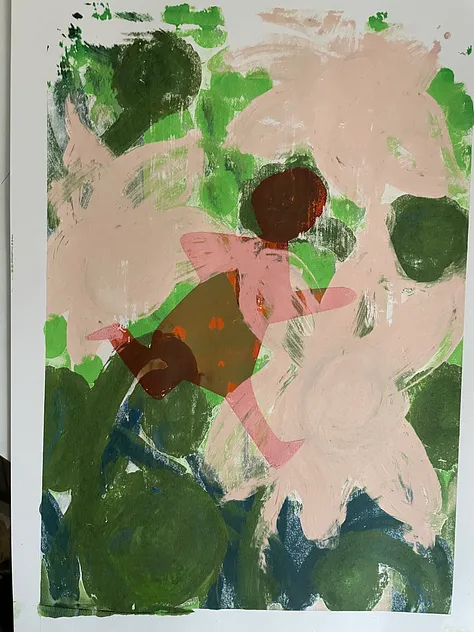
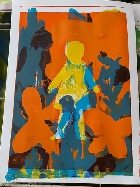
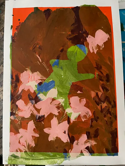
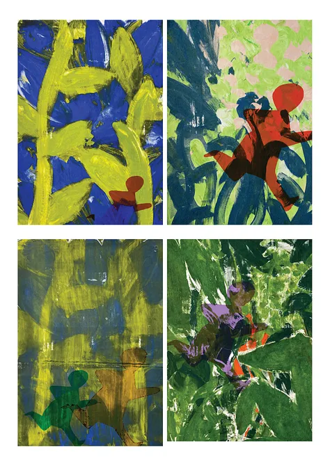
Day 1 - experiments in screen printing…the Jungle

I’ve only screen printed once before (pic above) so I don’t really know what I’m doing (although it’s funny, putting my first attempt at screen printing up here makes me look at it in a new light and there’s lots more I like about it than I thought!) But that doesn’t matter as it just means I’ll be learning EVEN MORE than usual. I went with the vision of using a stencil cut-out of a girl to create jungle images, where the jungle could be growing out of the girl or vice versa. I used stencils to keep it simple and cut down on the whole screen exposing faff. I also had a punt at monoprint screenprint, where you paint directly onto the screen and take a single pull of the image.

Monoprint screenprints
What went well?
I like how screen printing really covers the page with colour. I find I end up with a lot of white paper when I’m doing regular monoprint, so it was good to push myself to fill the page. There’s no time to faff with detail, otherwise the paint dries into the mesh, so I thought more about the overall composition (very quickly). My whole motivation behind screen printing is to get away from the details and think more about the bigger picture. I think it worked, and I actually found myself imagining much more close-up scenes of what it would be like in the undergrowth of the jungle. I also learned that it’s fun to print lighter colours on top of dark colours, the overlapping colours are a lot more interesting this way round.
What will I try next?
Now I’ve learned a bit about what stencils can do, and what monoprint screen printing can do, I’ll choose ONE image and work with it for a day. Screen printing is exhausting! So it will be nice to slow down and be more intentional with a single image, rather than trying to knock out as many as possible.
I didn’t go into this session with much intention about what I wanted to communicate in the image, so I’ll start the next session with this in mind.
Next time I can work in a different order, printing the jungle ontop of the girl or the girl ontop of the jungle. I can try moving the stencil and printing again. I’m interested to see what storytelling I can achieve through this stencil and monoprint/ screen print technique.
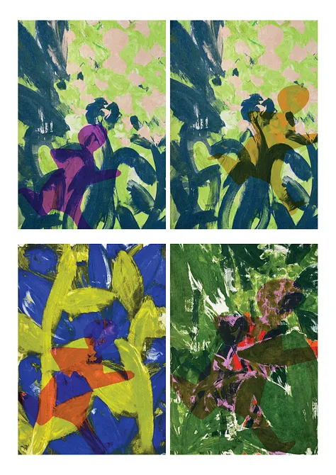
Photoshop play with screen print experiments
I also had a play with the experiments in photoshop, trying different colourways that might work for future prints. Day 2 - Monoprinting the South Bank Centre
I’ve been very inspired lately by cities, and have enjoyed drawing busy scenes with lots of people in my sketchbook.

I really loved this blue and yellow drawing of the South Bank from an early summer London trip. I’d tried making it into a series of paintings/collages (below) but wasn’t really feeling it, so I thought I’d have a go with monoprint (although now I look again at the painting I think maybe its got potential… oh the joys of reflecting!)

What went well?
It felt great to be back in my comfort zone after a day of exploratory screen printing. I also loved sitting down and taking my time over a couple of prints in a whole day. I tend to get in a rush and prioritise quantity over quality, so I enjoyed slowing down and giving some real love to the image. And I love the result! I got really into painting the grafiti in the undercroft, and it felt good to spend time thinking about what words to include, what subliminal messages to send to my readers! I like the colour palette, and using darker colours for the night time scene gave the building a really bold presence.

There was a happy accident with the sky being much more textured than expected. A new brand of extender meant the blue ink was much more transparent than I expected. But this really helped to bring the building forwards as the star of the show.
And I love that I accidentally left some nice negative white space at the bottom where the pavement is, great for placing some text which is something I always forget to do.

What next?
I’m looking forward to drawing some figures in the foreground (done already in the time it took to write this blog! see above pic) ALTHOUGH I am tempted to print another layer ontop with the skaters, as I found this worked well on Day 3.
I’ll play around with placing text ontop in InDesign, maybe see if a non-fiction vibe works, or perhaps a couple of characters will emerge for a story.
A close up scene of the grafitied undercroft would be cool, so I’ll have a go at printing that next time.
Day 3 - Developing monoprints of cities, taking the next step
An old pattern of mine is to flit excitedly from project to project. What I’m putting intention into this summer is creating work and then sticking with it, to take it to the next level. So with this in mind, I decided to stick with the London Southbank and I chose another observational drawing from my sketchbook to make into a monoprint using the same slow approach, painting layers with monoprinting inks that have been thinned ever so slightly with oil. My favourite colour palette is blue and orange, so I thought I’d give this a go with the London City Skyline, viewed from the Tate Modern. I’m a bit obsessed with the City of London skyline, so I was really energised to spend some time with the image.

What went well?
I loved painting all the building shapes in different colours, and scratching away the window patterns on them with a spoon. I think the colour palette worked really well and gave it a retro vibe. I’m a big fan of Miroslav Šašek’s work (check out this great book by Martin Salisbury all about his work) and felt like I was channelling some good ‘This Is’ vibes with the print. After printing the first layer with just the buildings, I was going to stop and draw the people on top when I got home as this felt like the safe option after a successful print. BUT NO! I came with the intention of really developing my work, so I dared to print the people onto a second layer. At lunchtime we’d been discussing how to get your characters to fit into their envrionment whilst also standing out and catching the readers eye. Wondering how to make this work I thought I’d have a play with the ghost prints (the feinter second and third ‘pulls’ from the same plate of ink).
I printed the people layer onto the ghost print first (below bottom), so the figures pop forwards as they have more weight. And I’m amazed how good it looked repeated onto the second ghost image (below top).


Ghost prints
I’m super proud as I then took this print ONE STEP FURTHER and dared to print another layer of characters on top! I’d made a nice picture but I felt the image needed a focal point. So, to tie it into the SouthBank Centre skate park work I did on Day 2, I decided to print a Dad and his daughter skating through the crowds. This was slightly inspired by my hubby and his daughter who like to skate together. Gaww.

What next?
Ghosting is a big feature of monoprinting and I’ve never thought about using it like this before, to choose which parts of the picture I want people to focus on by bringing them forward or knocking them back.
Big learning win!
I’ll change up the colours of the main 2 characters because they blend in to much with the figures next to them. A bit of photoshop or drawing on top of the prints will do the job. So all that’s left to do is draw some faces and little details onto the prints to finish them off. And plan the next big print room marathon for September when term starts again.
Or do I dare to try a bit of kitchen table printmaking?!
Until next time on the Print Room Diaries…


Comments